
Dec 05, 2023
Mastering Responsive Web Design: A Comprehensive Guide for 2023
Responsive web design is not just a trend; it's a fundamental approach to creating websites that can adapt to the diverse range of devices and screen sizes in use today. As we enter 2023, mastering responsive web design is more critical than ever. This comprehensive guide will take you through the key principles, best practices, and the latest techniques to ensure your websites provide an optimal user experience across all platforms.
Understanding Responsive Web Design
In essence, responsive web design is a method of designing and developing websites so that they provide an optimal viewing experience across a variety of devices. These devices include desktops, laptops, tablets, and smartphones. The goal is to ensure that users can access and interact with your website easily, regardless of the device they are using.

One of the core components of responsive web design is the use of fluid grids. Unlike traditional fixed grids, fluid grids use relative units like percentages rather than fixed units like pixels. This allows the layout to adapt proportionally to the screen size. As the screen gets smaller or larger, the elements on the page adjust accordingly.
The Key Components of Responsive Web Design
Let's delve into the key components that make up an effective responsive web design:
-
Fluid Grids:
As mentioned earlier, fluid grids are a foundational element of responsive design. They allow the layout to adapt smoothly to different screen sizes, ensuring a consistent and visually appealing experience for users.
-
Flexible Images:
Images play a crucial role in web design, and ensuring they adapt to various screen sizes is essential. Using CSS, you can make images flexible by setting their maximum width to 100%. This ensures that images scale proportionally to the width of their container.
-
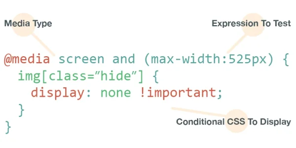
Media Queries:
Media queries are CSS rules that apply different styles based on characteristics such as screen width, height, and resolution. They enable developers to create a tailored layout for each type of device, ensuring an optimal user experience.
Best Practices for Responsive Web Design in 2023
With technology continually evolving, it's crucial to stay updated on the best practices for responsive web design. Here are some tips for ensuring your websites are responsive and user-friendly in 2023:
-
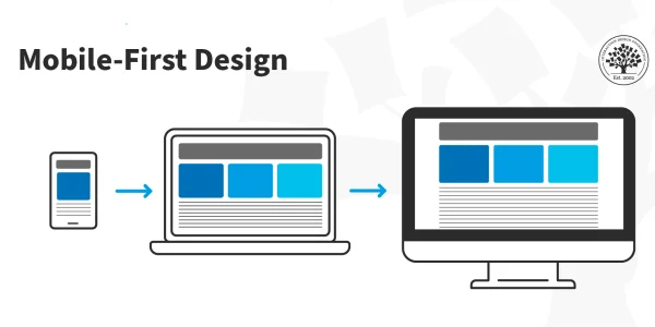
Start with a Mobile-First Approach:
Designing for mobile devices first ensures that your website's essential elements and content are prioritized for smaller screens. You can then progressively enhance the design for larger screens, ensuring a seamless transition.
-
Optimize Images:
Large, unoptimized images can significantly impact page load times. Compress and optimize images to improve performance, especially on slower network connections and mobile devices.
-
Test Across Devices:
Regularly test your website on various devices and browsers to identify and address any issues. Embrace testing tools that simulate different screen sizes and resolutions.
-
Implement Flexbox and Grid Layouts:
Modern CSS features like Flexbox and Grid Layouts provide powerful tools for creating flexible and responsive layouts. Embrace these technologies to simplify complex layouts and improve design flexibility.
The Importance of Accessibility in Responsive Design
As we strive for responsive design, it's essential to consider accessibility. Responsive design should not only cater to different devices but also to users with diverse needs, including those with disabilities. Here are some considerations:
-
Use Semantic HTML:
Structuring your content with semantic HTML elements not only improves search engine optimization but also enhances accessibility. Screen readers and other assistive technologies rely on semantic HTML to interpret and convey content to users.
-
Provide Alternative Text for Images:
Include descriptive alt text for images to ensure that users with visual impairments can understand the content. Alt text is also crucial for SEO and improves the overall user experience.
-
Ensure Keyboard Navigation:
Some users navigate websites using keyboards instead of mice. Ensure that all interactive elements on your site are accessible and usable via keyboard navigation.

Conclusion
Mastering responsive web design is an ongoing journey that requires a combination of technical expertise, creativity, and a user-centric mindset. As we step into 2023, the importance of creating websites that deliver seamless experiences across devices cannot be overstated.
By understanding the principles of responsive design, implementing best practices, and embracing the latest technologies, you can ensure that your websites not only meet but exceed user expectations. Remember that responsive web design is not just about adapting to different screen sizes; it's about creating inclusive, accessible, and delightful digital experiences for everyone.